Have you ever wondered why certain spaces make you feel happy and some don't? Did you ever think that there is a connection between you and the colours in your space?
Well, there is. Our mental and emotional state is strongly affected by the spaces we live in and the colours that it withholds.
“Colours are a reflection of our feelings and emotions.”
Our space holds imprints of memories from our situations, creating positive and negative feelings & emotions. These feelings and emotions get absorbed in the space where these experiences have occurred, in the form of energy. As a result, this energy reflects in our choices of likes and dislikes.
We shape our lives through the thoughts constructed in our mind which reverberates affecting us mentally, physically, emotionally and spiritually. Colours affect emotions, emotions affect our choices.
Also Read: Photographer and podcaster Sreenag partners with Design Dekko
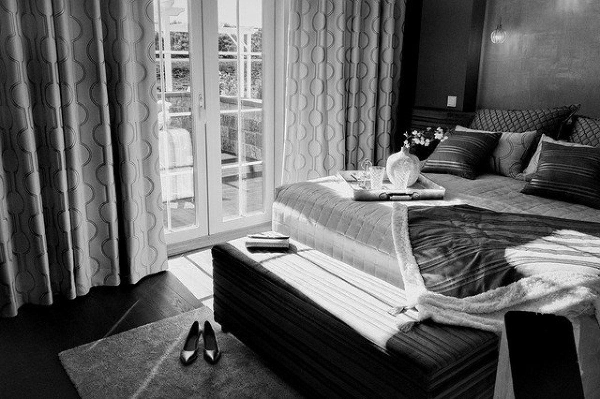
Colour plays a very significant role in our lives. Colour is a source of pleasure to everybody. Colours can change the moods, reduce or increase tensions, cause excitement and sometimes have a soothing effect on a tired person. Just as every yin needs a yang, every positive needs a negative, likewise everything that is white needs a black to have a sense of dichotomy and to feel complete. While colours breathe life into our lives, black and white brings a sense of tranquility; it's inanimate yet so full of life.
Did you know black and white are not colours?
An achromatic colour is one that lacks hues such as white, grey and black, And it means - free of any colour. Why is achromatic colour important? If there would be no achromatic colours then it wouldn't be possible to create a shade, tone, tint or colour.
Colours basically behave in three ways. They can be active, passive or neutral. Neutrals include black, grey, white and brown and these colours are often used to establish balance in a decor that includes both active and passive shades.
Black is the only colour that ABSORBS, which results in the other colours getting diluted in it. Black is required for all other colours to have depth and variation of hue.
The black colour is the absence of colour. Black is a mysterious colour that is typically associated with the unknown or the negative. It represents strength, seriousness, power, and authority. The colour black can evoke strong emotions and too much black can be overwhelming.
The colour black can represent both the positive and the negative. And that’s because different people perceive colours differently. How you perceive a certain colour may have a lot to do with your personal preference, experiences in the past, cultural differences, gender differences, and so on.
A lot of times people tend to think decorating with black is dark and depressing. But this isn't the case. The reality is that at least a little bit of black is essential in every room. It's dramatic, stylish, and provides a grounding effect that is necessary for every interior space.
Also Read: A Country House in the colonial tourist town in Mexico by Ar. Diego Yturbe Verea
You don't need to have a lot of black, just enough to tie things together to create balance. A few black picture frames on a wall, a black coffee table, black trim on the walls, or even something as simple as a little ribbon detail on a lampshade or pillow.
White is symbolic for, and is linked to cleanliness, purity and freshness. It is also linked to fresh starts, slate clean, an open mind, new beginnings, possibilities and opportunities for creation.
No matter what your colour preferences are, bold or subtle, colour balance is the most important secret in achieving your desired interior designed effect. It is also the most difficult to describe as it comes down to how your eye perceives the space around you.
White is the most commonly used colour in interior design. It gives us the impression of cleanliness and good hygiene, that’s the reason why we like to use white in a bathroom and kitchen, if there is any dirt, you see it and it gets cleaned up. White reflects all light so it makes spaces appear larger and that is why it is used on ceilings. It looks stunning when teamed with black, black and white checkered floor tiles.
Also Read: Working from home? Use these Vastu tips to run a successful business from home!
Yellow and white create a crisp fresh feel, red and white suggest a nautical theme, Blue and white gives a timeless look, and it teams up with any colour beautifully and subtly. That is why it is so popular.
White is very useful when starting out in interior decorating or design. Start with white wallsparound it to create the ideal space you are desiring for.
What comes to your mind when you hear the words ‘Black’ and ‘White’? A tendency to think in extremes: I am a brilliant success, or I am an utter failure. Black and white are two halves that together complete wholeness.
A black and white used in any interior space turns out to be spectacular. A coloured furniture item, wall, floor, upholstery, or any other piece in your home, is sure to become an attention magnet wherever it is positioned. This contrast adds a dash of sophistication to the room and also makes it a lot more elegant.
The views and opinions expressed in this article are those of the author’s.
Guest Coulmn
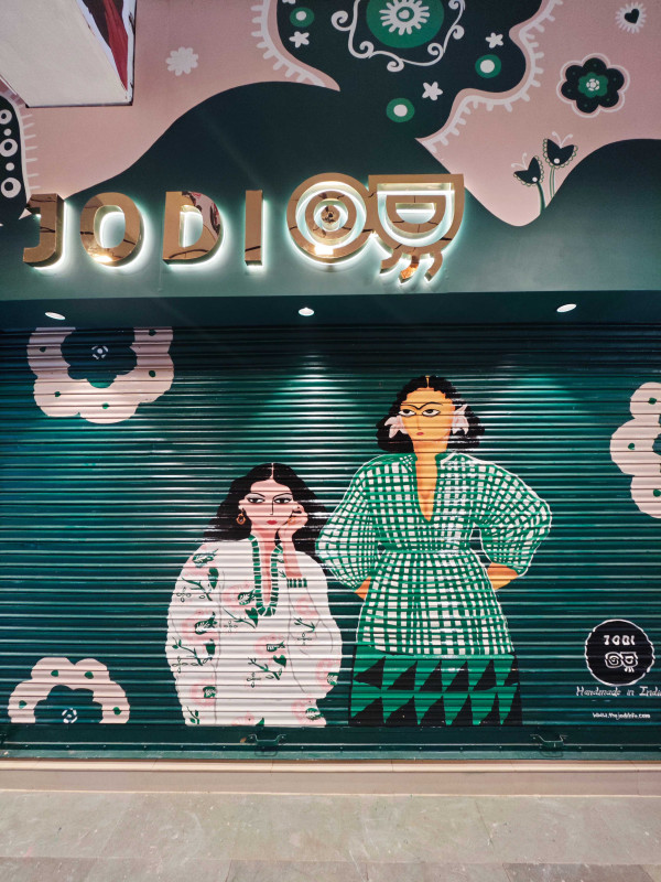
Tucked in Delhi’s Khan Market, the JODI Life store is a vibrant blend of fashion and culture, celebrating Indian craftsmanship. Designed by Alkove-Design, it fuses traditional elements with modern retail needs, creating a curated, sensory-rich space that reflects JODI’s unique identity and enhances
Guest Coulmn
This is your space where you should feel comfortable and confident. While doing up your space, most important is to make and plan and decide what you need from the house. Here are some easy to do tricks to give your interiors a new and refurbished look without spending a lot of money.
Guest Coulmn
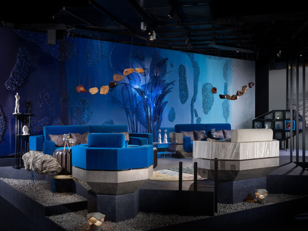
The Facette Collection by Maison Du Luxe, curated by Ar. Archana Aggarwal goes beyond furniture – it’s a journey of diverse viewpoints. Each piece features detailed patterns and bold colors that challenge traditional luxury, sparking curiosity and offering something new with every glance.


DeBorah Beatty | 22 Aug 2023
So good. I would love to talk to you about this, even though it's older, color doesn't change. I can't figure out how to contact you, so please forgive me doing it here. I publish a magazine and it's all about color. I've just launched it and would love to have several points of view included. If you're interested, you can contact me at colorisity (dot) mystic (at) gmail (dot) com, please. Thank you in advance.