Pantone chose very peri as the colour of 2022. Very Peri is dubbed as the happiest and warmest of all the blue hues, helping us to embrace an altered landscape of possibilities as we rewrite our lives in a post-Covid world. Appearing futuristic yet calm, it symbolizes the current times and the transitions the world is going through.
Very Peri has roots in wellness and the natural world with lilac and periwinkle plants bestowing a calming sense during a chaotic time. According to Pantone, the shade is inspired by the rising artistic community and is all about stretching the limits of reality.
Also Read: Easy Guide To Choose A Color Palette For Your Space
The best part is that this hue can be prominent as well as subtle depending upon how you use it. For a bolder look paint the walls of the room with this amazing hue. But if you want a subtle sophistication go for the very peri furnishings be it cushions, rugs or bed linen. The colour if used in moderation will make the interior look aesthetically very appealing. Remember to contrast it with neutral tones of green,beige, white and pink.
In the living room a very peri sofa or an armchair makes a statement while in other rooms you can use it on curtains or other furnishings to bring about warmth and happiness in your space.
Very Peri is a colour choice and can be used as highlighter tiles in the bathroom or the kitchen backsplash.


Also Read: Retrofitting an 80-year-old Art-Deco Apartment in Mumbai
Guest Coulmn
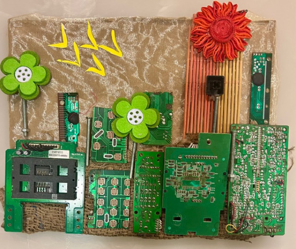
Sustainable art is where beauty meets responsibility. It is where artists become not only creators but also guardians of the Earth.
Guest Coulmn
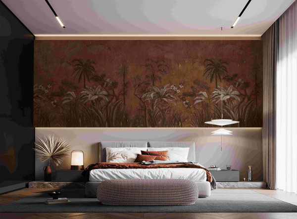
As the calendar turns to a brand-new year and winter’s icy breath whispers through the air, undeniable magic wraps itself around us. It’s a season of fresh starts and cosy comforts, a time to reflect on the beauty of transformation—both within ourselves and in the spaces we call home.
Guest Coulmn
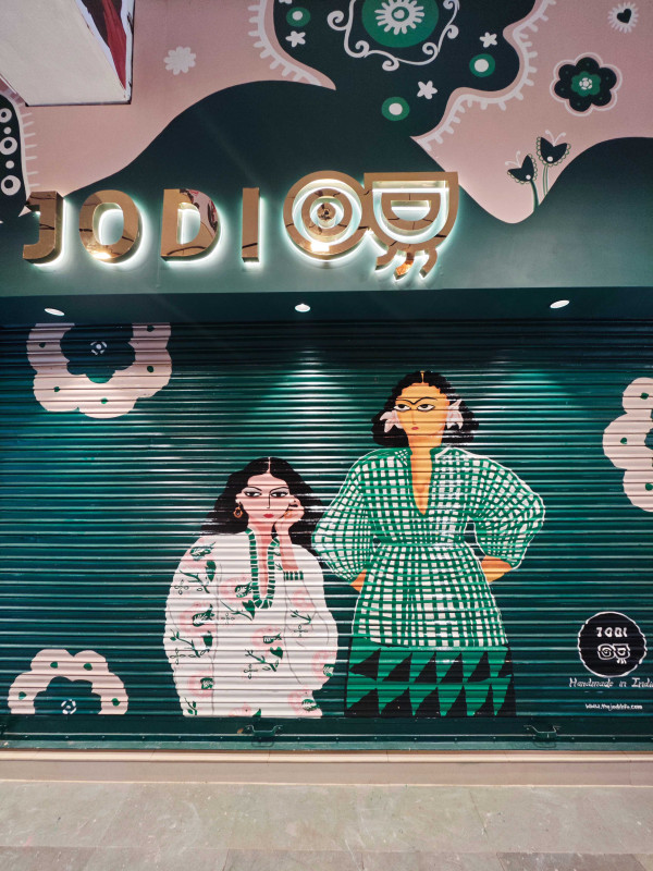
Tucked in Delhi’s Khan Market, the JODI Life store is a vibrant blend of fashion and culture, celebrating Indian craftsmanship. Designed by Alkove-Design, it fuses traditional elements with modern retail needs, creating a curated, sensory-rich space that reflects JODI’s unique identity and enhances